I’ve been doing a little reading on the art of design and the failure of art as design. (For example, see this piece about how objects for human use should be designed for, you know, humans.) That led me to the International Push/Pull Pictogram Design Competition, tasked with designing exactly what it says: a non-verbal universal symbol to indicate which way to move a door to open it. Some of them are awfully inspired and some of them are just awful. But the “winner”, I feel, simply replicates the problem:
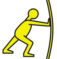
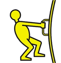
Quick: Which of these says “This door opens by pulling”?
I would argue that you can make a case for either one. The person on the right is clearly pulling, so maybe that means “Pull this door”. But the door is bulging outward — which says, to me, that the door is not cooperating — it isn’t opening — and so you shouldn’t pull, you should push. (Likewise, the person on the left is clearly pushing but the door isn’t opening; maybe pushing isn’t the right choice.)
The judges picking the winning logo gave the following explanation (in part):
The push symbol is as if the figure is pushing a car and the pull symbol is a figure pulling as if in a tug of war. For extra clarity and to give the impression of force and movement, the doors being pushed and pulled are bowed-shaped.
But in so doing, they fell prey to the same problem they thought they were solving: The pictogram needs to be explained, so it is neither universal nor obvious.
Personally, my choice would have been the one to the right of the upper-left corner of the submissions:
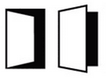
This is unambiguous as to how the door moves. It also serves as a nice warning that the door opens outward, in the second case. (There was a similar one with hands but I think that is too specific: The door opens inward whether you pull it or someone pushes on the other side.)
Leave a Reply
You must be logged in to post a comment.